Jina Core's New Logo: A Creative Spin on Planetary Design
It’s time to give Jina Core a makeover. And that all starts with our new logo.


Once upon a time, many moons ago, Jina AI launched with the aim of building the neural search solution. Back then we only had one product: the imaginatively-titled Jina, a framework for building neural search solutions.
Time, however, marches on. We’ve now got a lot more products under our belt, and our core product has been refocused on multimodal AI services with cloud-native technologies.
 jina-ai
Kinda makes our magnifying glass logo a bit disconnected from reality.
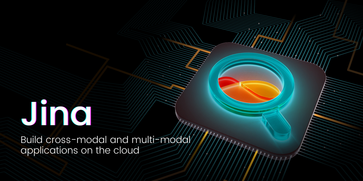
After all, magnifying glasses are usually associated with search, and that’s just not who are nowadays, y’know.
You know what that means. It’s time to give Jina a glow-up. And that starts with our new logo.
Let’s hope we did a better job than these folks:
Our designer, Tianshi, will take it from here, answering all the burning questions around the new look.
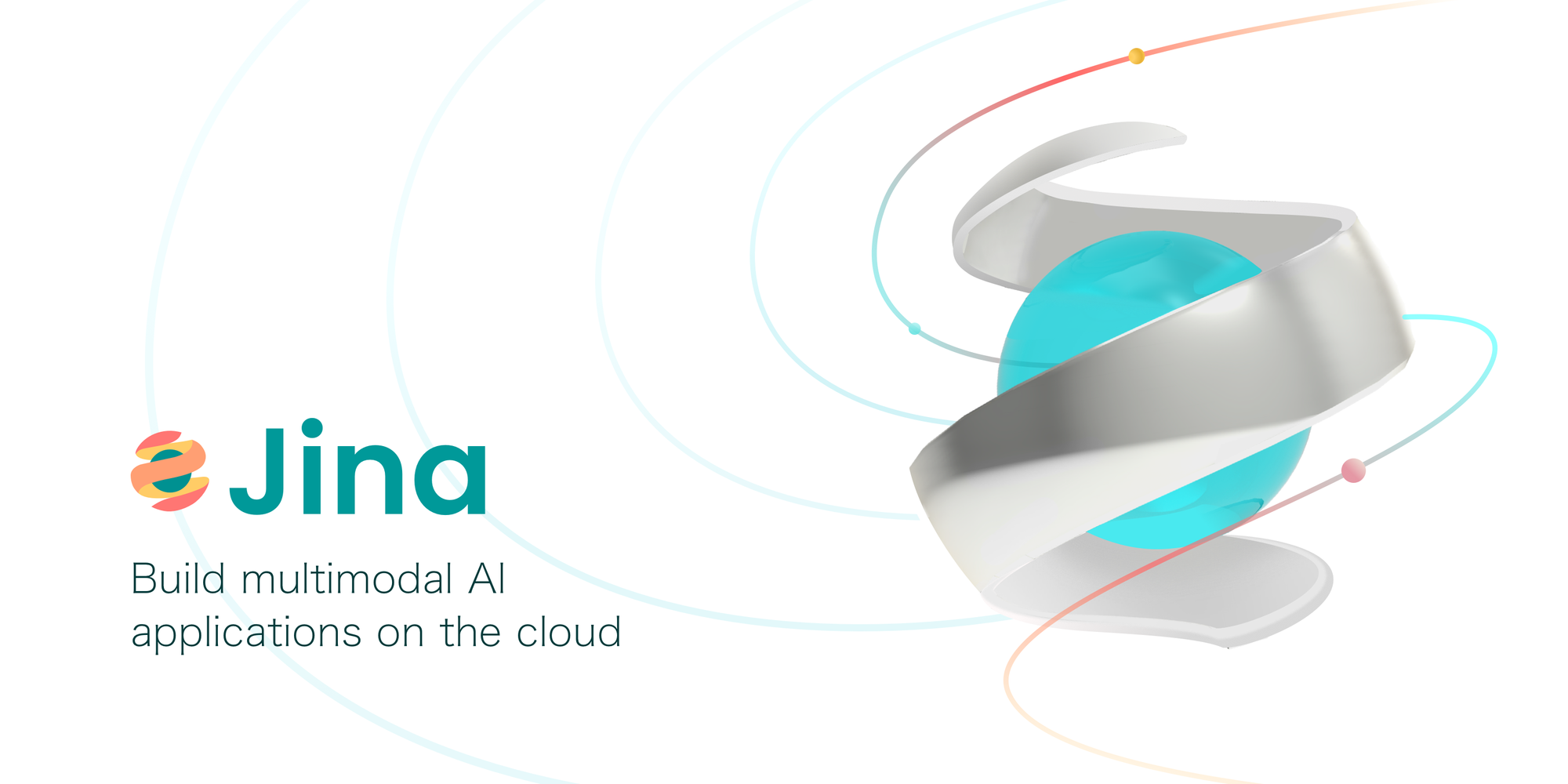
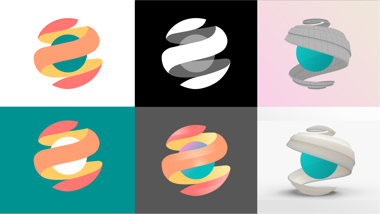
What does the new logo represent?
The new logo has got this cool blue planet hugged by a ribbon, which is all about flowing data. You know, data is like the lifeblood of the digital era, and it's pretty much everywhere. So, this swirling data ribbon suggests that when you get your data act together and set it in motion, the sky's the limit!

What are the meanings behind the colors in the new logo?
So, the new logo has a mix of green, red, and yellow. Green is all about tech, trustworthiness, and life itself, showing off Jina's dedication to diving deep into the data seas and playing the long game. Red brings in some zest and a youthful vibe, celebrating our fiery passion for the digital age. And then there's yellow, which is like a big ol' nod to the future, 'cause we're always chasing after the latest tech goodies to make the world a better place.
How does the new logo reflect Jina Core's brand personality?
By mashing up these three colors and their oh-so-deep meanings, the new logo manages to capture its essence in a funky, modern way. The logo's got this tech-savvy, youthful, and lively vibe going on, but at the same time, it feels like a warm hug, showing that we really care about making a difference for our customers and the world around us.
How does Jina Core facilitate a smooth Pythonic experience for developers?
Jina Core aims to provide a seamless experience for developers transitioning from local deployment to advanced orchestration frameworks such as Docker-Compose, Kubernetes, or Jina AI Cloud. It handles infrastructure complexity, making advanced solution engineering and cloud-native technologies accessible to all developers.
What tools did you use to create the logo? Why these ones?
When it comes to designing logos, my go-to tools are Sketch and Figma. Sketch is not only handy for creating user interfaces, but its canvas and palette features make it super easy to check out inspiration, whip up storyboards, and compare design options.
And because my colleagues are scattered all over the world, Figma's collaborative workspace is a real lifesaver. I can give feedback and comments on the spot and make changes in real-time, avoiding the agony of exporting and uploading PNGs, begging for feedback, and repeating the whole process until we're satisfied with the final version.
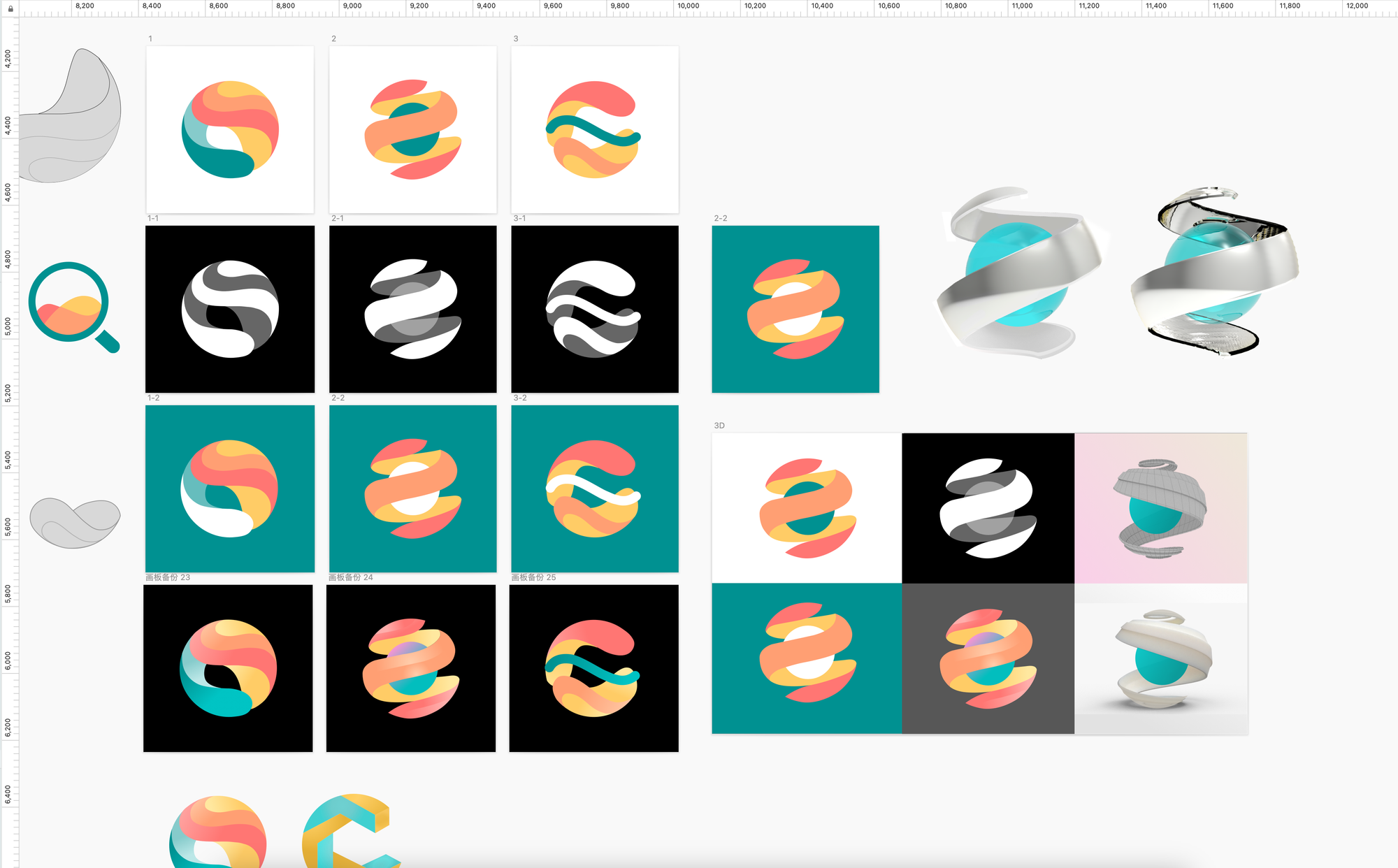
What’s your working process like? How do you even get started with designing a cool logo?
So, let me break it down for you. We're a company that's all about AI technology, and our stuff is pretty abstract and tricky to understand. My job? Well, it's to take all that brainy functionality and turn it into a symbol that anyone can grasp. As someone who's not a tech genius, I have to chat with the engineers to get a handle on what the product actually does. Then, I put it into words that even I can understand, and I come up with a bunch of different ideas to get inspired. After that, it's time to get down to business and sketch out some concepts. At the next meeting, I usually whip out 3-4 versions of my sketches and we all pick a couple to fine-tune and tweak. It's like magic - except with more brainpower and way less rabbits.
What ideas did you reject early on? What was your craziest or silliest idea?
You wanna talk design ideas? Well, let me tell you, I've learned that clients always have these grandiose, picturesque ideas that are just missing something. It's like trying to make out a blurry face with some details - sure, you can kind of visualize it, but it might not be the best approach. I try to steer them away from totally unrealistic or just plain ridiculous concepts from the get-go.
But, if you really wanna know my craziest design idea, it's actually something pretty simple. I've always wanted to put on a little exhibition of my work. I mean, come on, isn't that every designer or artist's dream? The only problem is, I'm a bit of a wuss when it comes to criticism. So, until virtual reality tech gets good enough for me to showcase my stuff in the digital world, I guess I'll just keep dreaming.
And oh boy, I'll never forget the silliest thing I ever designed. I drew this goofy little boat on the logo for Jina magnifier version.

It looked like something a kid would draw, and honestly, I thought it was pretty silly. But, to my surprise, everyone else seemed to love it too.
Wrapping up
Our new logo and rebranding at Jina Core really show off our love for innovation, excitement for all things tech, and dedication to the digital world. The design and colors capture what we're all about, giving us a fresh and engaging look. As we keep creating user-friendly software and diving into the data universe, our updated logo is the perfect symbol of our dreams and our non-stop quest to be the best in the business.