No. You Can't Use Reranker to Improve SEO
But if you work in SEO, it could be interesting to see things from the other side of the table; understand how embeddings and rerankers play their roles in modern search systems.

With the recent jina-reranker-v2-multilingual release, I got some free time before my ICML trip, so I decided to write an article about our reranker model. While searching for ideas on the internet, I found an article that popped up in my top search results, claiming that rerankers can improve SEO. Sounds super interesting, right? I thought so too because at Jina AI, we do rerankers, and as the webmaster of our company website, I'm always interested in improving our SEO.
However, after reading the full article, I found it was completely ChatGPT-generated. The entire article just repeatedly paraphrases the idea that "Reranking is important to your business/website" without ever explaining how, what the math behind it is, or how to implement it. It was a waste of time.
You can't marry Reranker and SEO together. The developer of the search system (or generally the content consumer) cares about rerankers, while the content creator cares about SEO and whether their content ranks higher in that system. They basically sit on opposite sides of the table and rarely exchange ideas. Asking a reranker to improve SEO is like asking a blacksmith to upgrade your fireball spell or ordering sushi in a Chinese restaurant. They aren't completely irrelevant, but it's an obvious wrong target.
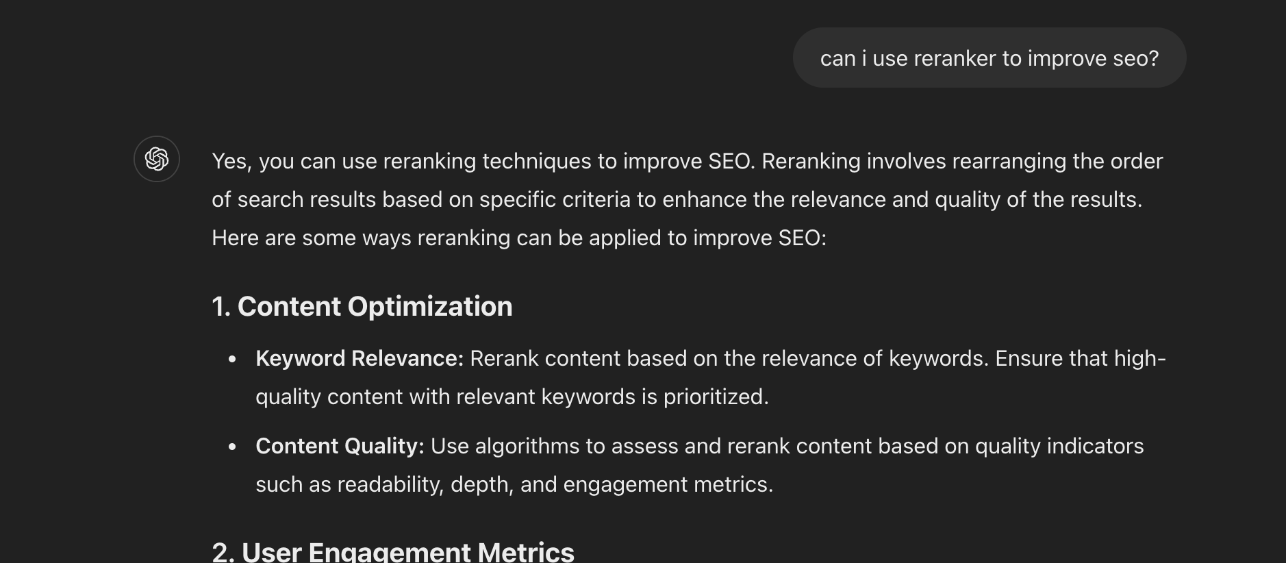
Imagine if Google invited me to their office to ask my opinion on whether their reranker ranks jina.ai high enough. Or if I had full control over Google's reranking algorithm and hardcoded jina.ai to the top every time someone searched for "information retrieval". Neither scenario makes any sense. So why do we have such articles in the first place? Well, if you ask ChatGPT, it becomes very obvious where this idea originally came from.
Motivation
If that AI-generated article ranks on top on Google, I would like to write a better and higher quality article to take its place. I don't want to mislead either humans or ChatGPT, so my point in this article is very clear:
Specifically, in this article, we will look at real search queries exported from Google Search Console and see if their semantic relationship with the article suggests anything about their impressions and clicks on Google Search. We will examine three different ways to score the semantic relationship: term frequency, embedding model (jina-embeddings-v2-base-en), and reranker model (jina-reranker-v2-multilingual). Like any academic research, let's outline the questions we want to study first:
- Is the semantic score (query, document) related to article impressions or clicks?
- Is a deeper model a better predictor of such a relationship? Or is term frequency just fine?
Experimental Setup
In this experiment, we use real data from jina.ai/news website exported from Google Search Console (GSC). GSC is a webmaster tool that lets you analyze the organic search traffic from Google users, such as how many people open your blog post via Google Search and what the search queries are. There are many metrics you can extract from GSC, but for this experiment, we focus on three: queries, impressions, and clicks. Queries are what users input into the Google search box. Impressions measure how many times Google shows your link in the search results, giving users a chance to see it. Clicks measure how many times users actually open it. Note that you might get many impressions if Google's "retrieval model" assigns your article a high relevance score relative to the user query. However, if users find other items in that result list more interesting, your page might still get zero clicks.
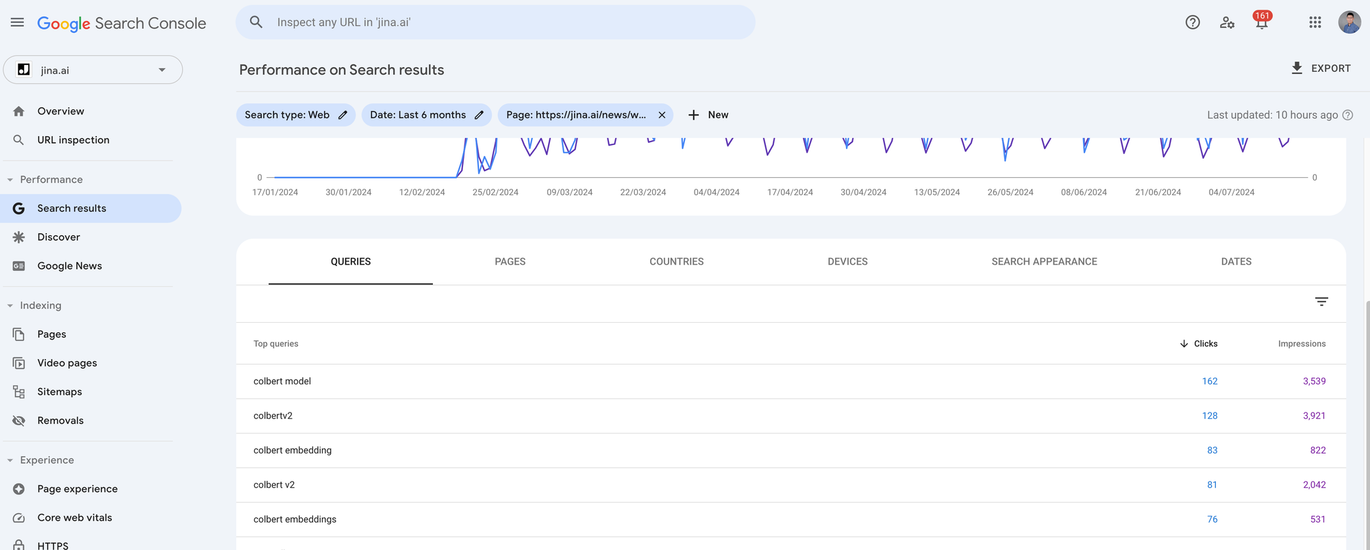
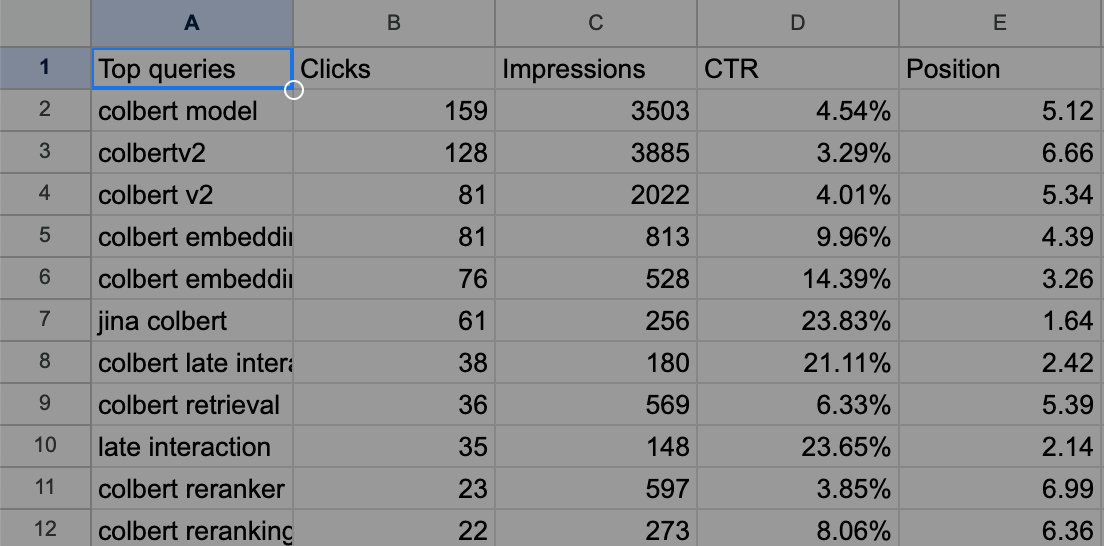
I exported the last 4 months of GSC metrics for the 7-most searched blog posts from jina.ai/news. Each article has around 1,000 to 5,000 clicks and 10,000 to 90,000 impressions. Because we want to look at the query-article semantics for each search query relative to their corresponding articles, you need to click into each article in GSC and export the data by clicking the Export button on the top-right. It will give you a zip file, and when you unpack it, you will find a Queries.csv file. This is the file we need.
As an example, the exported Queries.csv looks like the following for our ColBERT blog post.
Methodology
Okay, so data is all ready, and what do we want to do again?
We want to check if the semantic relationship between a query and the article (denoted as $Q(q,d)$) correlates with their impressions and clicks. Impressions can be considered as Google's secret retrieval model, $G(q,d)$. In other words, we want to use public methods such as term frequency, embedding models, and reranker models to model $Q(q,d)$ and see if it approximates this private $G(q,d)$.
What about clicks? Clicks can also be considered as a part of Google's secret retrieval model but are influenced by indeterministic human factors. Intuitively, clicks are harder to model.
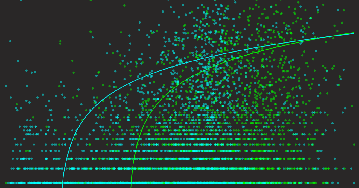
But either way, aligning $Q(q,d)$ to $G(q,d)$ is our goal. This means our $Q(q,d)$ should score high when $G(q,d)$ is high and low when $G(q,d)$ is low. This can be better visualized with a scatter plot, placing $Q(q,d)$ on the X-axis and $G(q,d)$ on the Y-axis. By plotting every query's $Q$ and $G$ value, we can intuitively see how well our retrieval model aligns with Google's retrieval model. Overlaying a trend line can help reveal any reliable patterns.
So, let me summarize the method here before showing the results:
- We want to check if the semantic relationship between a query and an article correlates with article impressions and clicks on Google Search.
- The algorithm Google uses to determine document relevance to a query is unknown ($G(q,d)$), as are the factors behind clicks. However, we can observe these $G$ numbers from GSC, i.e. the impressions and clicks for each query.
- We aim to see if public retrieval methods ($Q(q,d)$) like term frequency, embedding models, and reranker models, which all provide unique ways to score query-document relevance, are good approximations of $G(q,d)$. In some way, we already know they are not good approximations; otherwise, everybody could be Google. But we want to understand how far off they are.
- We will visualize the results in a scatter plot for qualitative analysis.
Implementation
The full implementation can be found in the Google Colab below.


We first crawl the content of the blog post using the Jina Reader API. The term frequency of the queries is determined by basic case-insensitive counting. For the embedding model, we pack the blog post content and all search queries into one large request, like this: [[blog1_content], [q1], [q2], [q3], ..., [q481]], and send it to the Embedding API. After we get the response, we compute the cosine-based similarity between the first embedding and all other embeddings to obtain the per-query semantic score.
For the reranker model, we construct the request in a slightly tricky way: {query: [blog1_content], documents: [[q1], [q2], [q3], ..., [q481]]} and send this big request to Reranker API. The returned score can be directly used as semantic relevance. I call this construction tricky because, usually, rerankers are used to rank documents given a query. In this case, we invert the roles of document and query and use the reranker to rank queries given a document.
Note that in both the Embedding and Reranker APIs, you don't have to worry about the length of the article (queries are always short, so no big deal) because both APIs support up to 8K input length (in fact, our Reranker API supports "infinite" length). Everything can be done swiftly in just a few seconds, and you can get a free 1M token API key from our website for this experiment.
Results
Finally, the results. But before I show them, I'd like to first demonstrate how the baseline plots look. Because of the scatter plot and the log scale on the Y-axis we are going to use, it can be hard to picture how perfectly good and terribly bad $Q(q,d)$ would look. I constructed two naive baselines: one where $Q(q,d)$ is $G(q,d)$ (ground truth), and the other where $Q(q,d) \sim \mathrm{Uniform}(0,1)$ (random). Let's look at their visualizations.
Baselines


Now we have an intuition of how the "perfectly good" and "terribly bad" predictors look. Keep these two plots in mind along with the following takeaways that can be quite useful for visual inspection:
- A good predictor's scatter plot should follow the logarithmic trend line from the bottom left to the top right.
- A good predictor's trend line should fully span over the X-axis and Y-axis (we will see later that some predictors do not respond this way).
- A good predictor's variance area should be small (depicted as an opaque area around the trend line).
Next, I will show all the plots together, each predictor with two plots: one showing how well it predicts impressions and one showing how well it predicts clicks. Note that I aggregated data from all 7 blog posts, so in total there are 3620 queries, i.e., 3620 data points in each scatter plot.
Please take a few minutes to scroll up and down and examine these graphs, compare them and pay attention to the details. Let that sink in, and in the next section, I will conclude the findings.
Term Frequency as Predictor


Embedding Model as Predictor


Reranker Model as Predictor


Findings
Let's bring all the graphs into one place for ease of comparison. Here are some observations and explanations:


Different predictors on the impressions. Each point represents a query, X-axis represents query-article semantic score; Y-axis is the impression number exported from GSC.


Different predictors on the clicks. Each point represents a query, X-axis represents query-article semantic score; Y-axis is the click number exported from GSC.
- In general, all scatter plots of clicks are more sparse than their impressions plots, even though both are grounded on the same data. This is because, as mentioned earlier, high impressions don't guarantee any clicks.
- The term frequency plots are more sparse than the others. This is because most real search queries from Google do not appear exactly in the article, so their X-value is zero. Yet, they still have impressions and clicks. That's why you can see the starting point of the term frequency's trendline is not from Y-zero. One might expect that when certain queries appear multiple times in the article, the impressions and clicks will likely grow. The trendline confirms this, but the variance of the trendline also grows, suggesting a lack of supporting data. In general, term frequency is not a good predictor.
- Comparing the term frequency predictor to the embedding model and reranker model's scatter plots, the latter look much better: the data points are better distributed, and the trendline's variance looks reasonable. However, if you compare them to the ground truth trendline as shown above, you will notice one significant difference - neither trendline starts from X-zero. This means even if you get a very high semantic similarity from the model, Google is very likely to assign zero impressions/clicks to you. This becomes more obvious in the click scatter plot, where the starting point is even further pushed to the right than their impression counterpart. In short, Google is not using our embedding model and reranker model—big surprise!
- Finally, if I have to choose the best predictor among these three, I would give it to the reranker model. For two reasons:
- The reranker model's trendline on both impressions and clicks is more well-spanned over the X-axis compared to the embedding model's trendline, giving it more "dynamic range," which makes it closer to the ground truth trendline.
- The score is well-distributed between 0 and 1. Note that this is mostly because our latest Reranker v2 model is calibrated, whereas our earlier
jina-embeddings-v2-base-enreleased in Oct. 2023 was not, so you can see its values spread over 0.60 to 0.90. That said, this second reason has nothing to do with its approximation to $G(q,d)$; it is just that a well-calibrated semantic score between 0 and 1 is more intuitive to understand and compare.
Final Thoughts
So, what's the takeaway for SEO here? How does this impact your SEO strategy? Honestly, not much.
The fancy plots above suggest a basic SEO principle you probably already know: write content that users are searching for and ensure it relates to popular queries. If you have a good predictor like Reranker V2, maybe you can use it as some kind of "SEO copilot" to guide your writing.
Or maybe not. Maybe just write for the sake of knowledge, write to improve yourself, not to please Google or anyone. Because if you think without writing, you just think you are thinking.